In this post, TFB’s newest team member, Camden Dechert, will take us through the ins and outs of material design -Christina
I heard about Material Design for the first time a few months ago from my coworker at VCU Technology Services. Together, we had been developing a new designed campaign for Technology Services that would give our brand a facelift. I began exploring Material Design as a new way to approach our new brand. It lent me the freedom to stay within our university brand guidelines, but also add that extra oomph.
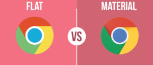
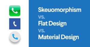
I was interested in learning about this new language because it is starting to revolutionize the way we design. Companies are beginning to implement Material Design into their logos, graphics, websites, and apps. The differences are subtle, but they make a huge difference once you notice it.
So, what is it?
In 2014, Google developed a new design language called Material Design, otherwise known as Quantum Paper.
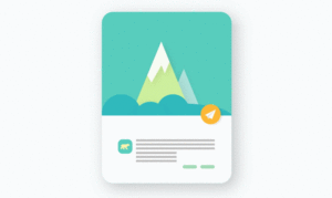
Designed by Matías Duarte, Material Design makes more liberal use of grid-based layouts, responsive animations and transitions, padding, and depth effects such as lighting and shadows.

Google announced Material Design on June 25, 2014, at the 2014 Google I/O conference, but it is within the past year that it is being noticed by people other than designers. As of 2015, most of Google’s mobile applications for Android had applied the new design language, including Gmail, YouTube, Google Drive, Google Docs, Sheets and Slides, Google Maps, Inbox, Google+, all of the Google Play-branded applications, and to a smaller extent the Chrome browser and Google Keep. The desktop web-interfaces of Google Drive, Docs, Sheets, Slides and Inbox have incorporated it as well. More recently, it has started to appear in Chrome OS, such as in the system settings, file manager, and calculator apps
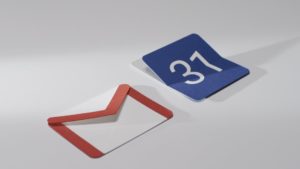
 Duarte explained that, “unlike real paper, our digital material can expand and reform intelligently. Material has physical surfaces and edges. Seams and shadows provide meaning about what you can touch.” According to Google, their new design language is based on paper and ink but implementation will take place in an advanced manner
Why use it?
 Material Design is revolutionary because of how amazingly well thought out it is. Success in implementing Material Design comes from following a type system, a color guide focusing on bold, but subtle, limited color, three-dimensional environment qualities focusing on surfaces, shadows and depth, and a meticulously gridded layout.
Material is the metaphor. Material Design is inspired by the physical world and its textures, including how they reflect light and cast shadows. Material surfaces reimagine the mediums of paper and ink.
How should I use it?
 Check out this guide for all the information you need on Material Design. https://material.io/

Good primer! If you have time, you might want to go back and fix the text alignment of the images for this post. It may look good on desktop, but on my Android device. it is breaking individual words apart every few characters, which makes it hard to read any text that is near the images. Feel free to delete this comment once you review it.